 You should also know my scanner's doing some weird thing where everything white is blue. I don't feel like tinkering with the settings so I did this "old" thing to cover it up.
Friday, May 18, 2007
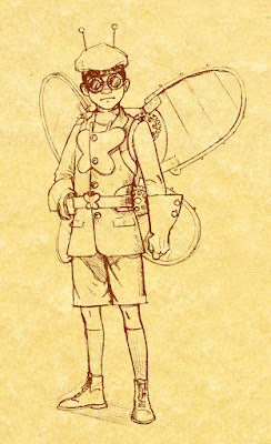
Butterfly sketch
Many, many moons ago I met a nice fellow by the name of Dean Trippe. He created a snazzy little comic called Butterfly. In this meeting he said I should draw up a nice Butterfly and then he'd link me. Well...many, many moons later (that's now) I've started working on it. The concept is Butterfly at the dawn of the 19th Century. I think I want to actually draw him flying and in a more dynamic pose, but this gives you an idea of where I'm headed. Thoughts? Suggestions?
 You should also know my scanner's doing some weird thing where everything white is blue. I don't feel like tinkering with the settings so I did this "old" thing to cover it up.
You should also know my scanner's doing some weird thing where everything white is blue. I don't feel like tinkering with the settings so I did this "old" thing to cover it up.
Subscribe to:
Post Comments (Atom)


11 comments:
Digging it! His outfit looks great! I love the little shoes and socks, perfect period stuff! I think you could play more with the mechanism for the wings. Right now, the gears may look a little more like symbols of steamtech than part of a real apparatus.
I've totally given up on scanning color with my scanner, which is stupid, 'cause it's huge and expensive. I'm pretty sure all we need to do is get a scanning calibration target and recalibrate them. What kind of scanner do you have? If we can use the same kind of target, I'll order one up, and let you use it when I'm done.
Thanks! I'm still not sure about the big butterfly symbol on the chest. I was thinking maybe he'd have a butterfly pin on his lapel or maybe he'd just be identifiable by the backpack and antenna hat alone.
And yeah, the gears have that "just stuck on for good measure" look at the moment. I was planning on doing a few schematics for a convincing butterfly backpack. Possibly one that winds up.
My scanner is of the Microtek persuasion. I think the settings just got squiffy and can be adjusted. If, however, my usual tinkering doesn't fix it then I'll take you up on the calibration target.
i liked this so much i sent you a myspace message about it. though i guess i could've just said it here...
Thanks! I haven't gotten it yet, but I'll check it a little later.
I'm kind of excited about it. I'm working on ideas for the backpack now.
I like the big chest emblem, although I'm curious to see what you have in mind for the lapel-pin.
Mine's a Microtek, too. I'll let you know when I get a calibration target.
That looks really neat Shane, I love his outfit and his gloves are really awesome.
I was going to bring up the butterfly symbol on his chest though, which I think is perhaps a little distracting and a bit much. I like the idea of a lapel pin though.
i like butterflies.
O_o
I'm with Joel on the big chest emblem.
This is awesome by the way.
I love this! I don't have anything intelligent to add that hasn't already been discussed, so I'll just say that it is delightful and my suggestion is to keep on rockin'.
And I like the "old" thing.
And I totally want that outfit.
Maybe if the butterfly emblem was bigger? I really only wanted to make a suggestion that no one else has, but think about it, it may work better if the emblem is worked into the coat on a larger scale, bigger yet, somehow more subtle.
Post a Comment