 You should also know my scanner's doing some weird thing where everything white is blue. I don't feel like tinkering with the settings so I did this "old" thing to cover it up.
Friday, May 18, 2007
Butterfly sketch
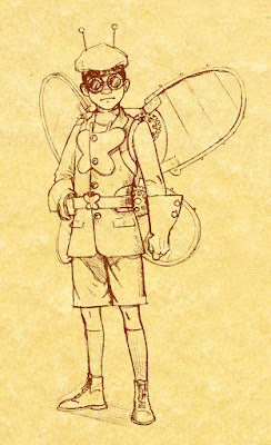
Many, many moons ago I met a nice fellow by the name of Dean Trippe. He created a snazzy little comic called Butterfly. In this meeting he said I should draw up a nice Butterfly and then he'd link me. Well...many, many moons later (that's now) I've started working on it. The concept is Butterfly at the dawn of the 19th Century. I think I want to actually draw him flying and in a more dynamic pose, but this gives you an idea of where I'm headed. Thoughts? Suggestions?
 You should also know my scanner's doing some weird thing where everything white is blue. I don't feel like tinkering with the settings so I did this "old" thing to cover it up.
You should also know my scanner's doing some weird thing where everything white is blue. I don't feel like tinkering with the settings so I did this "old" thing to cover it up.Thursday, May 17, 2007
More old stuff! Yay!
How about some illustrations!? I never know if the exclaimation point should go before or after the question mark. It isn't in any MLA handbook I've got lying around. So...onto the illustrations.
This was for a story about evil bosses. I know I had my share before I landed at the CA so I drew inspiration from that...and the many, many, completely retarded memos that we got.
This was for a story about evil bosses. I know I had my share before I landed at the CA so I drew inspiration from that...and the many, many, completely retarded memos that we got.

This was for a story about the juvenile court justice system in Memphis. I was later told by the writer that someone had complained that it was racist to not make juvie justice African-American. I'm pretty sure someone would have complained either way.

And lastly, this one was for a story about the "Trust Pays" campaign in Memphis in which students are offered monitary rewards for stepping forward and blowing the whistle on shady goings-on in their schools. The story explores whether or not that's a good idea.

Wednesday, May 16, 2007
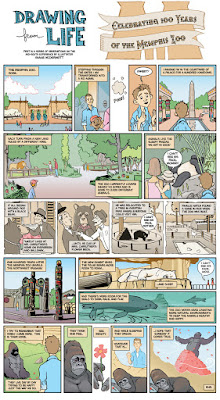
Drawing from Life comic series
So...some of you have been on my case to get cracking and do a little more posting. I have some serious catching up to do so I offer this recycled stuff while I crank out a few new things. Most of you have probably seen these, but there are probably a tiny few of you who haven't...so...check em out. I'm gearing up to do two more this year and possibly a great big 8 to 12 page Christmas story with the same characters you'll meet in THIS Christmas story. Fancy.


The Plane! The Plane!
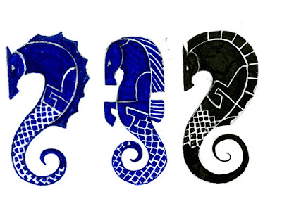
I've decided that I definitely want a tattoo. No, I'm not talking about the short, island-dwelling, plane-arrival-announcing chap from Fantasy Island. What would I do with him? I'm talking about having someone poke pigments into my skin over and over again with a pointy needle. Sounds scary doesn't it? It can't be that bad.
What am I getting? I'm glad you asked. I'm getting a seahorse. (wow, I can practically hear the fake "oh...uh...cool" responses now.) Why a seahorse? I'm glad you asked! (But we didn't ask.) Shut up. Yes, you did.
My Celtic Moon sign is the seahorse...which is basically the same as a pisces in the sun zodiac. The Celtic seahorse, however, has the ability to swim the watery, dreamworld of our imagination, but can, in addition, walk in the land of reality. I think it sort of fits me because I wanted badly for years to have a career in art, but it wasn't until I figured out that I had to make it happen that I started achieving my goals. I go back and forth between thinking its all a load of seahorse crap and thinking there just might be some kind of mathmatical equation working itself out in the universe that we can all sorta tap into and use to navigate our lives. Is it a coincidence that one of my stories has to do with dragons and that a star was named after me in the Draco constellation? Is it a coincidence that another story close to my heart features a flying lighthouse and I find myself working at a newspaper under the scripps flag...a flag which bares the image of a lighthouse? Hmmmmmmmmmmmm. I think life is more fun with a little romance so I'm going to say that there are no coincidences.
Anyway, I'm thinking of getting the tattoo on my upper right shoulder. These are a few of my first sketches. Any suggestions?

Saturday, April 14, 2007
C'mon and vote HACKENSLASH!
 Look, people, the time draws near for this round to be over and the whopping lead that Hackenslash had over the Die-ities is getting smaller.
 If you're out there...and you're reading this...which you probably aren't because I have like...zero blog traffic...I'm asking you to go vote Hackenslash. Clearly the superior team.
So get out there and get voting at Fistacuffs!
Wednesday, April 11, 2007
I almost forgot!
 I designed my first tattoo recently for a friend and she just had it done. Check it out. I hope she doesn't mind me plastering the picture all over the place. I should probably check. She sings in a band -hence the clef and her daughter's birth flower is the lily of the valley. I sketched several concepts, but this is the one everyone liked the best. I'm working on a design for my friend...who happens to be her brother and I'm also working on a design for myself. Hopefully, I'll settle on something and maybe I'll get it this summer! I'll post my sketches soon.
Campaign-o-rama!
 Not much time left, folks. Better head on over to the polls...or...well...blogs at Fist-a-cuffs and vote! Sincerest apologies for the lack of swankness to the ol' poster, but I had to do courtroom sketches at the John Ford trial for work today and I'm worn out. 30 minutes on this and I'm off to la la land. Will I dream of VICTORY??..or DEFEAT???
Monday, April 09, 2007
Not Sweet Victory!
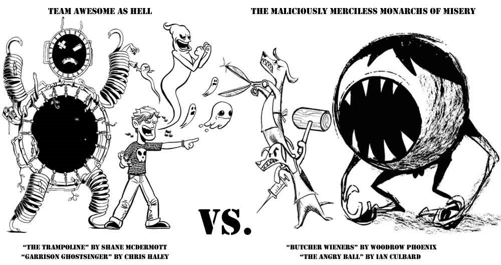
 It seems that Hackenslash has begun the untidy process of cleaning the clocks of Team Awesome As Hell. I don't want to sway the fight against fate's will, but I do ask all of you to stop on by Fistacuffs and vote. No...don't just vote...VOTE YOUR CONCSIENCE!
 Stay tuned for a message from your good friend The Trampoline!
Sunday, April 08, 2007
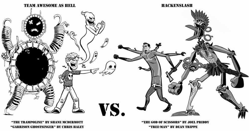
Sweet Victory!
 Sweet Victory! Team Awesome As Hell survived the first round and has progressed to round two. It is a terrible twist of fate, however, that we are going up against the mighty Hackenslash. Who will win?? Either way the victory will be bitter-sweet...not unlike the chocolates I'm stuffing into my face right now!
Friday, April 06, 2007
Wednesday, April 04, 2007

Maybe I shoud try posting some actual art...
 This is a flying lighthouse. Broken-hearted robot lads from distant galaxies use them for travelling to earth in what usually turn out to be failed attempts at stealing the moon in hopes of towing it back to their previously mentioned distant galaxies so as to win back the hearts of certain robot lasses. That was an awesome run-on sentence.
Anyway, this piece is a couple of years old, but as I've yet to get a chance to complete the story and/or website that accompany it...I like to keep it around. It makes me feel bad for being a slacker. Hopefully, that will change this year as I attempt to finish...and by finish I mean restart where I left off...my first graphic novel "The Moon Story."
I'm not really a slacker. I work 5 days a week as a newspaper illustrator, sometimes freelancing in educational comics...and other sometimes I teach.
The lighthouse and cliff edge are were inked, scanned, colored in photoshop, and then placed on a scan of the moon and sky painted in gouache. This was one of the first times I inked with a brush and I was still getting used to it. I look forward to revisiting this piece sometime soon.
Monday, March 26, 2007
One last thing...
...or maybe two.
First thing. If you guys were unclear on the size for the postcards, the dimensions were 150% larger than original the final size of 5 x 7. That means the art needs to be completed at 7.5 X 10.5 inches. Feel free to work larger than that. I call myself making...myself...clear on that one, but in the event that I didn't, I offer apologies. As a general rule of thumb, though, it's always best to work 125 to 150% larger than your print size will be.
I had originally hoped that we could print our map pieces at 16 X 36, but alas, we were unable to secure the roll of paper for the swank printer. There are two options. If you print on 11 X 17 paper change your dimensions to 7.111 X 16 inches. If you print on 13 X 19 paper then your output dimensions need to be 8 X 18 inches. It would be nice if everyone printed on the same size paper, but I won't cry if you don't. I'm hoping that most people will see this before printing and choose 11 X 17 as I know some of you already have. I'll be in DA3 to collect them between 8:30 and 9-ish.
Second thing. Thanks so much for the card and the vomit. (I like saying that) I was honestly very touched by it. I hope that I did a good job for you guys this semester and that you not only learned some new things which will help you in your illustration studies and careers, but that you also enjoyed it. I had a blast and I learned a lot as well. So...thanks for all your hard work and thanks for teaching me some new things as well. If ever in the future you guys need or want input, feel free to contact me. I look forward to seeing your work as it progresses. I'll miss you guys.
Thanks again,
Shane
NPDA Update-o-rama
This is serious business, folks. If you've met with your groups, cranked out some work, and been to an NPDA broadside meeting(critique) or two...then give yourself a pat on the back. You've got the talent AND the dedication. Talent means a lot, but it's nothing without dedication.
If you've met with your groups, cranked out a little work, but haven't made a meeting. You're on your way. You're trying. I know work schedules don't always permit critique attendance. I appreciate the effort. Just make sure that when you try you're trying your absolute best. Illustration isn't a career field that permits anything less.
If you haven't met with your group, you haven't done any work, and haven't attended a meeting...your grade for the project is in serious jeopardy. There's still time to kick it in high gear and contribute. If there's no high gear-kicking then the grade will most definitely be a big ZERO. One zero has the power to drag a semester average down to failing.
So...if you're working your hardest you'll most likely continue to do so throughout your college career and success waits for you on the horizon. If you're kinda working, but aren't really dedicated to illustration...there could be some serious non-illustration careering lurking around the corner. But...you can turn it around and get the cool success-horizon thing too. If you're not working hard and you're not dedicated to illustration then now is DEFINITELY the time to start.
That means work, people! You're all talented and all capable, but you have to make your minds up that SCHOOL comes first.
-Shane
Scanning Line Art
So...you wanna know how to scan line art and create layers in photoshop.
Well...I'll tell you. Take out paper and a pencil...or...well...just click print.
Ready??
Here we go.
If you have crisp black and white line art (not an inkwash or pencil sketch) scan it in as line art in "tiff" format. The option may vary depending on the scanner you're using. It should be something like "line art" or "black and white." Set your dpi (dots per inch) to 600. It may say ppi which is pixels per inch. Pretty much the same thing. You can scan the image into photoshop and save it to your folder later or you can scan it and send it directly into your folder. Good times. So...place your 10X14 image on the scanner so as to only get the top half of your image. Preview. Adjust your settings for line art and dpi. Scan. Repeat the process for the bottom half. Unless of course your image is horizontal and you scan them as a left half and a right half. Everyone still with me? If you're scanning an inkwash or a pencil sketch...keep everything the same as for line art, but change the mode to grayscale.
Ok...now, you've scanned both halves. If they aren't already open in photoshop you'll have to go to your folder and find them. Make sure you open them with photoshop and not picture viewer. You're going to want to go to IMAGE and ROTATE CANVAS to get them right side up. If you go to the menu bar at the top there should be an option called image. Click on image and scroll down to MODE. Change the mode to grayscale. When it's done change it to RGB or CMYK. Go up to FILE and then click NEW. In the window that pops up change your image size settings to 11 X 15 (or 15 X 11) and set the resolution to 600. Make sure you choose the mode that matches your line art. Either RGB or CMYK. The top right tool of your tool bar is the "MOVE TOOL." It's a black arrow with a weird little plus sign beside it. Click that guy. Move him over the top half of your image and drag it onto your new document. Repeat the process for your second half. Now you can use the move tool to line them up. If they're not already open...you're going to need to go to window and open your HISTORY, LAYERS, and CHANNELS. Layers and channels are docked together so you'll have to click on one of the tabs and drag it off onto the desktop to separate them. In your LAYERS pallet there should be a little white box next to the handy word OPACITY. Pick one of your layers and change the opacity to 50-ish percent. Now you can see through the image and can more easily line them up. If they're a little cockeyed you're going to have to go to EDIT and FREE TRANSFORM. You can rotate the image a bit until it lines up. When they are lined up you can set the opacity back to 100%. Go to your eraser tool in the tool bar and click on it. It's ok...he's your friend. At the top menu there should be the word brush and a number beside it. Click on the drop down arrow by the number. Now move your MASTER DIAMETER slider to 1000 or 1500-ish. Set your hardness to 0, your opacity to 30 and click on the airbrush tool. The two halves should overlap. Line the middle of your eraser with the line where your art overlaps. It may take a little moving to find it. Move your eraser along the line a few times until you've gotten rid of any areas that don't jive.
Next...Sheesh, this looks like a lot...but it's not.
Next, make sure your image halves are lined up and in the middle of the new document. Go to LAYER and FLATTEN IMAGE. Next, we make a line art and color layer. (if you remember the process I showed you on Friday...cool. If not...forget it...I have an easier way). Your layer should say background. Click and drag it down to the new layer icon in the layers pallet and it will make "background copy." Click in your background layer. Go to EDIT and FILL it with white. Go back to the background copy and call it line art...or drawing. Go to SELECT, COLOR SELECTION, and using your eyedropper tool click anywhere in the white. Now you can just press delete and you've got a line art layer. Go back to the background and click on it. Click on your new layer icon and you get layer 1 in between line art and background. Change the name to color and do all the painting or coloring in this layer.
Now...don't do anything else in the line art layer. We'll get to that later. For now...just do some painting or coloring in the color layer. Play with brush sizes, textures, and opacities. Try different tools for selecting areas and see what they'll do. Try the magic wand and polygonal lasso tools.
If you have any questions email or call me and I'll be glad to walk you through it again. If this seems like a lot and you want to wait until Friday in class that's fine...but start working on your out of class project instead. You should be working on something.
Good luck.
-Shane
posted by ShanicusMaxi
National Portfolio Day Broadside
Class,
As you know MCA enters the National Portfolio Day Broadside contest every year. This year is no exception and your talents are needed. The teams have yet to be decided, but there will be the mingling of designers, illustrators, and photographers. There are to be three meetings to discuss and critique the work. These will take place on Tuesdays during lunch. The dates have also yet to be decided so I need to know what your schedules are like on Tuesdays. Email me or reply to this as soon as you can and let me know so we can figure out the best possible meeting times. Your grade will be determined by the finished product and not just from your contribution to it. This will replace either the second or third out-of-class assignment.
cheers,
Shane
Thumbnail Homework
Hey Class,
Just in case there is confusion about the homework...I've posted this handy little message.
There are two assignments. An in class assignment and an out of class assignment. EACH of them require 40 thumbnails.
1.) In Class Editorial Assignment: 40
You could choose from either the "evil boss" story or the "pet friendly home" story. There should be 40 thumbnails for one of these...or 20 for each of them. Or 15 and 35. I don't really care. Just that there are 40 thumbnails for the editorial piece.
2.) Illustrate a Cliche: 40
I want to see 40 thumbnails for this assignment too. (hold the groans) You can do thumbnails for any of the cliches on the list, but it's in your best interest to do more thjmbnails for fewer cliches as opposed to a few thumbnails for every cliche on the list. Please excuse the run-on sentence.
Illustration 3 and 4
well...it's the first day of class and i'm posting to my blog as well as my live journal. Fancy. Unfortunately, I have nothing of any weight to discuss at the moment so I'm just filling up space. I suppose I could research one of the illustrators on the list, but I've kinda already done that. Mayhaps later. For the time being this will have to suffice. The students are working ever so dilligently and I've more assignments to hand out...so...I'm off.
Subscribe to:
Comments (Atom)

