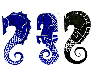
What am I getting? I'm glad you asked. I'm getting a seahorse. (wow, I can practically hear the fake "oh...uh...cool" responses now.) Why a seahorse? I'm glad you asked! (But we didn't ask.) Shut up. Yes, you did.
My Celtic Moon sign is the seahorse...which is basically the same as a pisces in the sun zodiac. The Celtic seahorse, however, has the ability to swim the watery, dreamworld of our imagination, but can, in addition, walk in the land of reality. I think it sort of fits me because I wanted badly for years to have a career in art, but it wasn't until I figured out that I had to make it happen that I started achieving my goals. I go back and forth between thinking its all a load of seahorse crap and thinking there just might be some kind of mathmatical equation working itself out in the universe that we can all sorta tap into and use to navigate our lives. Is it a coincidence that one of my stories has to do with dragons and that a star was named after me in the Draco constellation? Is it a coincidence that another story close to my heart features a flying lighthouse and I find myself working at a newspaper under the scripps flag...a flag which bares the image of a lighthouse? Hmmmmmmmmmmmm. I think life is more fun with a little romance so I'm going to say that there are no coincidences.
Anyway, I'm thinking of getting the tattoo on my upper right shoulder. These are a few of my first sketches. Any suggestions?


7 comments:
the third is the strongest, i think. you have to be careful with those thin lines of negative space, though...i've heard that it'll bleed into itself if it isn't big enough.
the concept and design are really great. a seahorse is a wonderful idea for a tattoo.
K, I think I just spent entirely too long staring at those horsies. Anyhoo, I think the one in the center is perhaps more "you". The one on the right looks a little sinister, and the one on the left looks a little plain.
I can see the one in the center carved into the woodwork of the cheftain's hut at Rohan. It's proud, strong and noble.
April,
Thanks. I hadn't thought about the thin line thing yet. Hmmm. It will probably be 3 to 4 times bigger than this...do you think that would help? I'll be posting other versions later. Some that are colored and some that are just black.
Chris,
I'm torn between the one in the middle and the one on the right. The one in the middle is more anatomically accurate for a seahorse...what with their protruding bellies and all, but I kind of like the swrirl kicking out behind him like the ones flanking him. Hmmm.
i was looking at it more from a design standpoint...i liked the more fluid s-shape, with the leg tucked beside him instead of in front. there are elements of the second that i like more, though.
as far as the lines go, it seems like if it's as big as you're saying it'll be it probably won't be a problem. i'm no expert though. ask chris :)
oh, that's his other leg. my mistake.
There are elements of all three I really like.
As to April's concern, the size you're talking about would negate any problems with the negative space.
I'm going to have to think on it more.
OOooh... I am leaning toward the center one, I like the mane and the head on it. I agree with mr. coker that the others are a little too "sinister" or something, and the center seems the most like you. The others also look more like sea-dragon-horses, which may or may not be what you want. But overall, I like the way it's going and the whole seahorse idea. Seahorses are neat.
Post a Comment