


So which one do you guys like?? I've tinkered with it so many times and created SOOOO many variations that it's all starting to run together. I'd love specific suggestions if you guys have any. I'm ready to finish this thing and move onto the rest of the home page layout and then start plotting out the individual comic layouts.
THOUGHTS?? QUESTIONS?? COMMENTS??


1 comment:
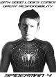
In my opinion the text itself get's lost in the circle area. I would suggest blocking that area off so that the text is secluded from the original "S" shape.
OR
You could even make it possibly simpler by putting a one or two point stroke that matches the background color (that sort of tan toned paper). That will give just enough room for the "E" to be readable.
Other than that I would dim the background elements (the sketchwork) even further so that the text stands out even more, while still maintaining a subtle amount of that sketch behind the text.
Either way, it's looking good, but could just use very slight refinements.
Post a Comment